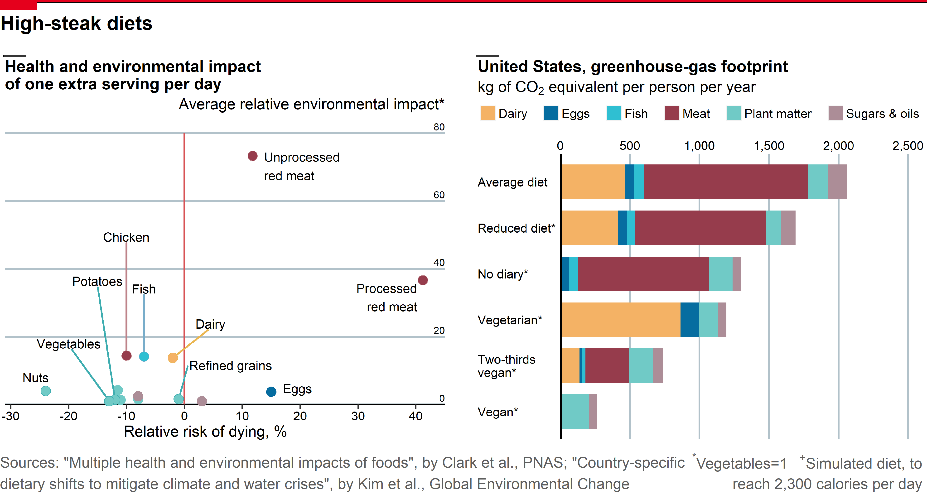
Replicating The Economist Plot: How much would giving up meat help the environment?
Workflow on how to replicate The Economist Plot from the daily chart entitled 'How much would giving up meat help the environment?' using ggplot2 package in R. The plot gives us an insight that going vegan for two-thirds of meals could cut food-related carbon emissions by 60%. We are going to break down the plot into two separate subplots and will be combined as one using grid package.

Introduction
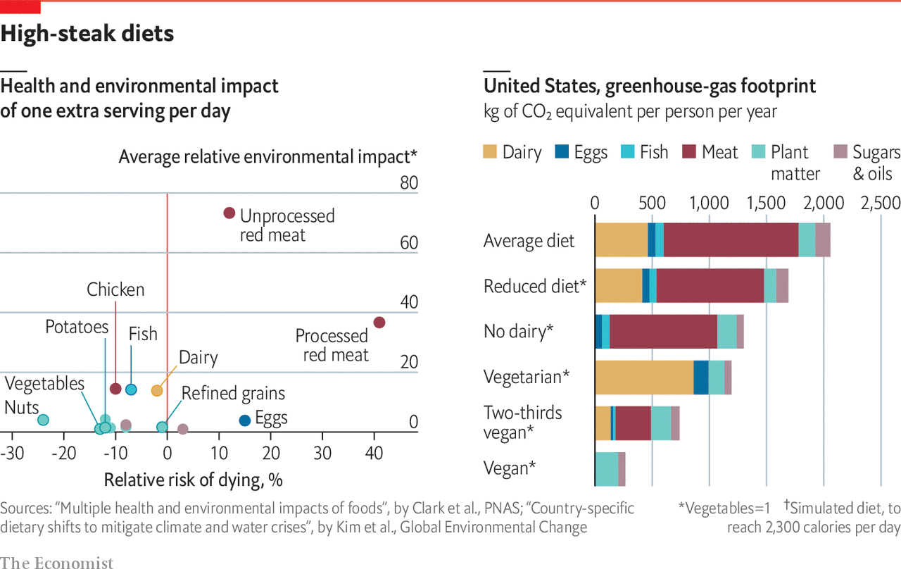
Here is our reference visualization from The Economist Plot: How much would giving up meat help the environment?
library(readxl) # read excel file
library(dplyr) # data wrangling
library(ggplot2) # data visualization
library(ggrepel) # for geom_text_repel
library(scales) # modify axes label
library(stringr) # string manipulation

library(png) # open png image
library(grid) # grid graphics for png
library(gridExtra) # additional function for grid package

options(warn=-1) # supress warning
library(extrafont)
# font_import()
loadfonts(device = "win")

custom_font_family <- "Segoe UI"
Left Plot
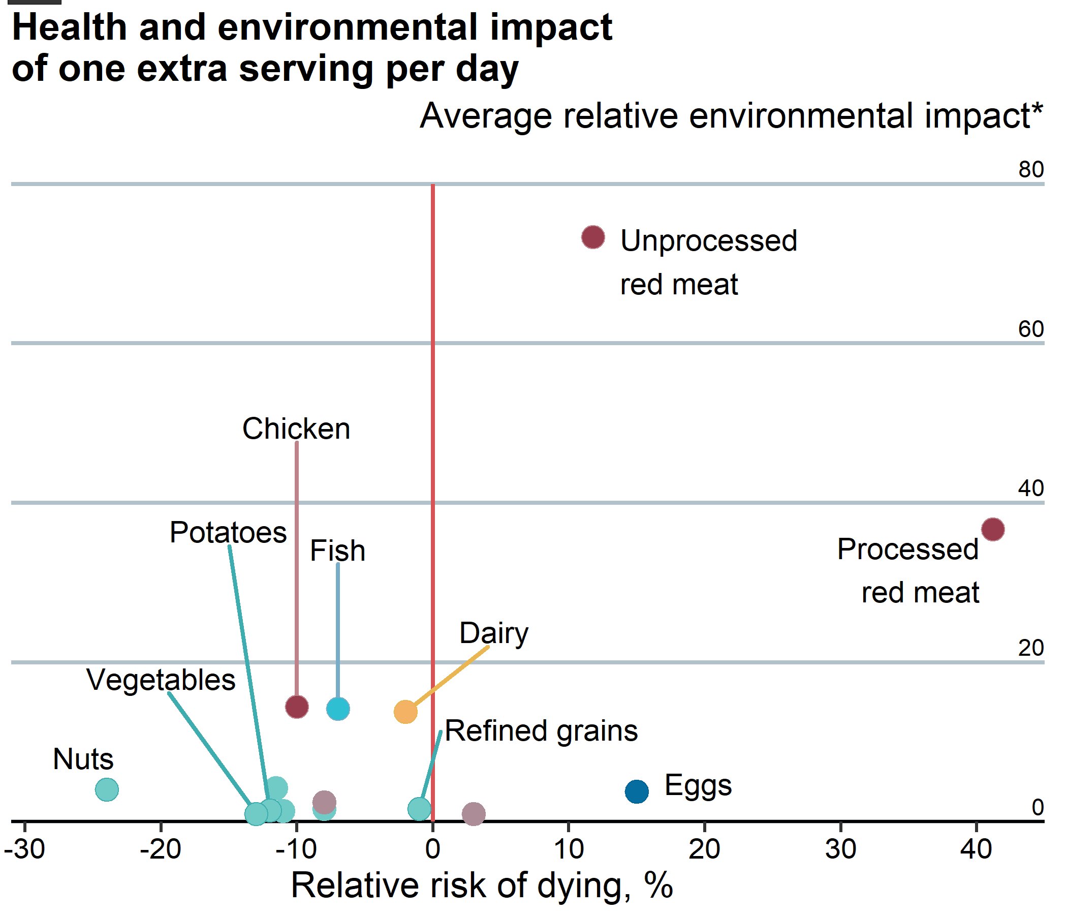
This plot visualizes the health and environmental impact of one extra serving per day for each food type. The source of dataset is from PNAS research article "Multiple health and environmental impacts of foods", by Clark et al., PNAS".
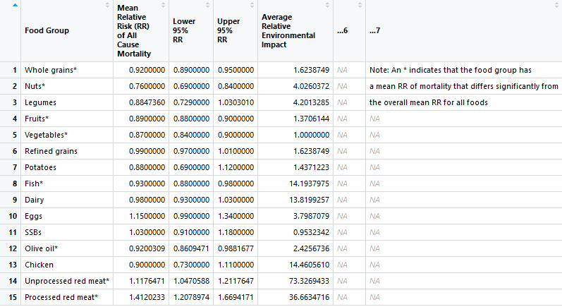
data_left <-
  read_xlsx("data_input/pnas.1906908116.sd01.xlsx", sheet = 4, skip = 1) %>%
  select(food_type = `Food Group`,
         relative_risk = `Mean Relative Risk (RR) of All Cause Mortality`,
         env_impact = `Average Relative Environmental Impact`) %>%
  mutate(relative_risk = (relative_risk-1)*100)

head(data_left)
data_left[1] <- lapply(data_left[1], function(x) gsub('\\s+', ' ', x))

# remove asterisk
data_left[1] <- lapply(data_left[1], function(x) gsub('\\*+', '', x))

head(data_left$food_type)
data_left_clean <-
  data_left %>%
  mutate(
    food_group = as.factor(
      case_when(
        food_type %in% c("Whole grains", "Nuts", "Legumes", "Fruits", "Vegetables", "Refined grains", "Potatoes") ~ "Plant matter",
        food_type %in% c("Chicken", "Unprocessed red meat", "Processed red meat") ~ "Meat",
        food_type %in% c("SSBs", "Olive oil") ~ "Sugars & oils",
        TRUE ~ as.character(food_type)
        )
    )
  )

str(data_left_clean)
plot_left <-
  ggplot(data = data_left_clean,
         aes(x = relative_risk, y = env_impact)) +
  geom_hline(yintercept = 0,
             lwd = 0.75) +
  geom_vline(xintercept = 0,
             col = '#D85356',
             lwd = 1) +
  geom_point(aes(color = food_group), size = 5)

plot_left

Here, we create custom_color_palette to customize the color of geom_point() for each food_group.
custom_color_palette <- list(dairy = "#F4B265",
                             eggs = "#066DA0",
                             fish = "#2FBFD2",
                             meat = "#963C4C",
                             plant = "#70CAC6",
                             sugar = "#AC8D97")
Then, change the scale of both x and y axes, add necessary labels, and use custom_color_palette which is already defined above.
plot_left <-
  plot_left +
  scale_x_continuous(limits = c(-31, 45),
                     expand = c(0, 0),
                     breaks = seq(-30, 40, by = 10)) +
  scale_y_continuous(limits = c(0, 80),
                     expand = c(0, 0),
                     position = "right") +
  labs(title = "Health and environmental impact\nof one extra serving per day",
       x = "Relative risk of dying, %",
       subtitle = "Average relative environmental impact*\n") +
  scale_color_manual(values = unlist(custom_color_palette, use.names = FALSE)) +
  coord_cartesian(clip = 'off')

plot_left

Apply theme to resemble the original plot.
plot_left <-
  plot_left +
  theme(
      text = element_text(family = custom_font_family, size = 17,
                          color = "black"),
      plot.title = element_text(face = "bold", size = 18),
      plot.subtitle = element_text(hjust = 1),

      axis.text.x = element_text(color = "black"),
      axis.text.y = element_blank(),
      axis.title.x = element_text(hjust = 0.43),
      axis.title.y = element_blank(),
      axis.ticks.length = unit(5, "pt"),
      axis.ticks.x = element_line(size = 0.75),
      axis.ticks.y = element_blank(),

      panel.background = element_blank(),
      panel.grid.minor = element_blank(),
      panel.grid.major.x = element_blank(),
      panel.grid.major.y = element_line(color = "#B2C2CA", size = 1),

      legend.position = "none"
    )

plot_left

Manually add the y-axis inside the plot by using geom_text().
plot_left <-
  plot_left +
  geom_text(
    data = data.frame(env_impact = seq(0, 80, 20)),
    aes(label = env_impact),
    x = 45,
    hjust = 1,
    vjust = -0.4
  )

plot_left

highlight_color <- list(dairy = "#EAB651",
                        eggs = "#006399",
                        fish = "#78ADCA",
                        meat = "#BE838A",
                        plant = "#3EADB0")
Create a new data frame called data_left_highlight to store the label together with its nudge_x and nudge_y properties.
data_left_highlight <- data.frame(
  food_type = c("Chicken", "Potatoes", "Fish",
                "Dairy", "Refined grains",
                "Vegetables",
                "Nuts", "Eggs",
                "Unprocessed red meat", "Processed red meat"),
  nudge_x = c(0, -3, 0, 6.5, 9, -7,
              -4, 2, 2, -1),
  nudge_y = c(35, 35, 20, 10, 10, 17,
              4, 1, -3, -5)
)

data_left_highlight
We loop through each row of data_left_highlight to highlight the points one by one.
plot_left_highlight <- plot_left
for (row in 1:nrow(data_left_highlight)) {
  data_highlight <-
    data_left_clean %>%
    filter(food_type == data_left_highlight$food_type[row])

  if (row <= 6) {
    # text with segment line (repel)
    plot_left_highlight <-
    plot_left_highlight +
      geom_text_repel(
        aes(label = food_type,
            family = custom_font_family),
        size = 5,
        data = data_highlight,
        segment.color = highlight_color[data_highlight$food_group],
        segment.size = 1,
        nudge_x = data_left_highlight$nudge_x[row],
        nudge_y = data_left_highlight$nudge_y[row],
        direction = "y"
      )
  } else {
    # text without segment line
    plot_left_highlight <-
    plot_left_highlight +
      geom_text(
        aes(label = str_wrap(food_type, 10),
            family = custom_font_family),
        size = 5,
        data = data_highlight,
        nudge_x = data_left_highlight$nudge_x[row],
        nudge_y = data_left_highlight$nudge_y[row],
        hjust = ifelse(row == 10, 1, 0)
        )
  }

  plot_left_highlight <-
    plot_left_highlight +
    geom_point(
      data = data_highlight,
      shape = 21, size = 5,
      color = highlight_color[data_highlight$food_group],
      fill = custom_color_palette[data_highlight$food_group])
}

plot_left_highlight

png("output/economist_meat_plot_left.png", width = 7, height = 6, units = "in", res = 300)
plot_left_highlight

# add header: black line
grid.rect(x = 0.0575, y = 0.995,
          hjust = 1, vjust = 0,
          width = 0.05,
          gp = gpar(fill="#353535",lwd=0))
dev.off()
Right Plot
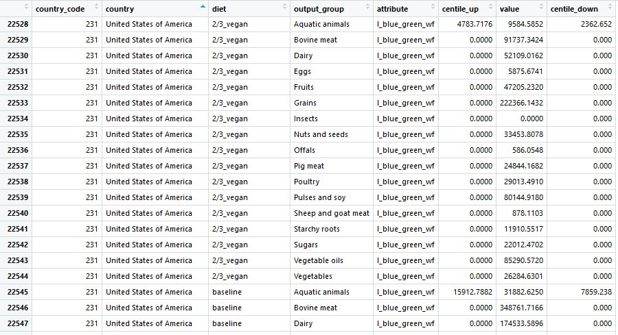
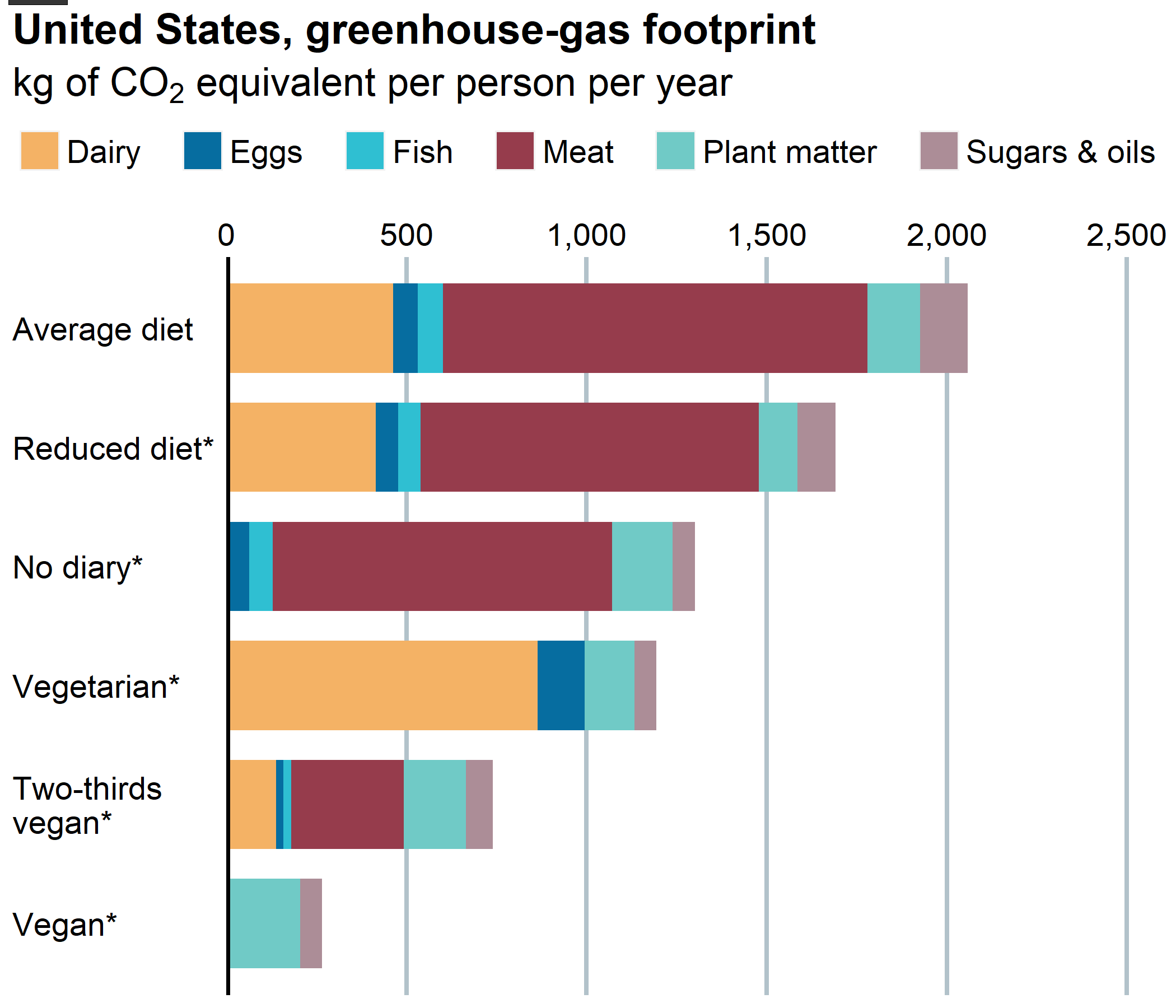
This plot visualizes the greenhouse-gas footprint (kg of CO2 equivalent per person per year) in United States for each diet type and food group. The source of dataset is from ScienceDirect article "Country-specific dietary shifts to mitigate climate and water crises, by Kim et al., Global Environmental Change".
Data Wrangling
Before we go any further with the visualization, let's us prepare the data:
-
Read the data from csv file
-
Filter the data which country is "United States of America" and attribute is the greenhouse-gas footprint which stored as "kg_co2e_total"
-
Filter
diet_typebased on plot: "Average diet", "Reduced diet", "No dairy", "Vegetarian", "Two-thirds vegan", and "Vegan" -
Select columns of interest:
diet,food_type, andvalue
diet_type <- c("baseline", "baseline_adjusted", "no_dairy", "lacto_ovo_vegetarian", "2/3_vegan", "vegan")

data_right_clean <-
  read.csv("data_input/diet_footprints_by_country_diet_output_group.csv") %>%
  filter(country == "United States of America",
         attribute == "kg_co2e_total",
         diet %in% diet_type) %>%
  select(diet, food_type = output_group, value)

head(data_right_clean)
Mapping food group
Just like the left plot, we need to create a mapping from food_type into food_group since the color of bars corresponds to each individual food group, which are: Dairy, Eggs, Fish, Meat, Plant matter, and Sugars & Oils. Then we drop food_type since it's not being used for our plot.
data_right_clean <-
  data_right_clean %>%
  mutate(
    food_group = as.factor(
      case_when(
        food_type %in% c("Aquatic animals") ~ "Fish",
        food_type %in% c("Bovine meat", "Insects", "Offals", "Pig meat", "Poultry", "Sheep and goat meat") ~ "Meat",
        food_type %in% c("Fruits", "Grains", "Nuts and seeds", "Pulses and soy", "Starchy roots", "Vegetables") ~ "Plant matter",
        food_type %in% c("Sugars", "Vegetable oils") ~ "Sugars & oils",
        TRUE ~ as.character(food_type)
        )
    )
  ) %>%
  select(-food_type)

str(data_right_clean)
plot_right <-
  ggplot(data = data_right_clean,
         aes(x = reorder(diet, value, sum), y = value)) +
  geom_col(aes(fill = food_group),
           position = position_stack(reverse = TRUE),
           width = 0.75) +
  geom_hline(yintercept = 0,
             lwd = 1.5) +
  coord_flip()

plot_right

Here, we change the scale of both x-y axes, add necessary labels, and use custom_color_palette which is already defined above.
plot_right <-
  plot_right +
  scale_x_discrete(labels = str_wrap(rev(c("Average diet", "Reduced diet*", "No diary*", "Vegetarian*", "Two-thirds vegan*", "Vegan*")),
                                     width = 15)) +
  scale_y_continuous(limits = c(0, 2600),
                     expand = c(0, 0),
                     position = "right",
                     labels = comma) +
  labs(title = "United States, greenhouse-gas footprint",
       subtitle = expression(paste("kg of ", CO[2], " equivalent per person per year"))) +
  scale_fill_manual(values = unlist(custom_color_palette, use.names = FALSE))

plot_right

Apply theme to resemble the original plot.
plot_right <-
  plot_right +
  theme(
    text = element_text(family = custom_font_family, size = 17),

    plot.title = element_text(face = "bold", size = 18),
    plot.title.position = "plot",
    plot.subtitle = element_text(face = "bold"),

    axis.text = element_text(color = "black"),
    axis.text.y = element_text(hjust = 0),
    axis.title = element_blank(),
    axis.ticks = element_blank(),

    panel.background = element_blank(),
    panel.grid.minor = element_blank(),
    panel.grid.major.x = element_line(color = "#B2C2CA", size = 1),
    panel.grid.major.y = element_blank(),

    legend.title = element_blank(),
    legend.position = "top",
    legend.direction = "horizontal"
  ) +
  guides(fill = guide_legend(nrow = 1))

plot_right

png("output/economist_meat_plot_right.png", width = 7, height = 6, units = "in", res = 300)

# shift legend
plot_right <-
  plot_right +
  theme(
    legend.spacing.x = unit(3, units = "pt"),
    legend.text = element_text(margin = margin(
      r = 15, unit = "pt")),
    legend.justification = c(0, 0.875)
    )
gt <- ggplot_gtable(ggplot_build(plot_right))
gb <- which(gt$layout$name == "guide-box")
gt$layout[gb, 1:4] <- c(1, 1, max(gt$layout$b), max(gt$layout$r))
grid.newpage()
grid.draw(gt)

# add header: black line
grid.rect(x = 0.0575, y = 0.995,
          hjust = 1, vjust = 0,
          width = 0.05,
          gp = gpar(fill="#353535",lwd=0))
dev.off()
png("output/economist_meat_plot_combined.png", width = 13, height = 7, units = "in", res = 300)

# step 1: read left and right plots
img1 <- rasterGrob(as.raster(readPNG("output/economist_meat_plot_left.png")), interpolate = FALSE)
img2 <- rasterGrob(as.raster(readPNG("output/economist_meat_plot_right.png")), interpolate = FALSE)
spacing <- rectGrob(gp=gpar(col="white"))

# step 2: arrange two plots
grid.arrange(img1, spacing, img2, ncol = 3,
             widths = c(0.49, 0.02, 0.49))

# step 3: add red line
grid.rect(x = 1, y = 0.995,
          hjust = 1, vjust = 0,
          gp = gpar(fill='#E5001C',lwd=0))
grid.rect(x = 0.04, y = 0.98,
          hjust = 1, vjust = 0,
          gp = gpar(fill='#E5001C',lwd=0))

# step 4: add title
grid.text("High-steak diets",
          x = 0.165, y = 0.94,
          hjust = 1, vjust = 0,
          gp = gpar(fontsize=20, fontfamily=custom_font_family,
                    fontface="bold"))

# add caption (left)
caption_left <- 'Sources: "Multiple health and environmental impacts of foods", by Clark et al., PNAS; "Country-specific\ndietary shifts to mitigate climate and water crises", by Kim et al., Global Environmental Change'
grid.text(caption_left,
          x = 0, y = 0.02,
          hjust = 0, vjust = 0,
          gp = gpar(fontsize=15, fontfamily=custom_font_family,
                    col="#5E5E5E"))

# add caption (right, top)
caption_right_top <- expression(paste(""^"*", "Vegetables=1\t",
                                      ""^"+", "Simulated diet, to"))
grid.text(caption_right_top,
          x = 0.995, y = 0.055,
          hjust = 1, vjust = 0,
          gp = gpar(fontsize=15, fontfamily=custom_font_family,
                    col="#5E5E5E"))

# add caption (right, bottom)
grid.text("reach 2,300 calories per day",
          x = 0.995, y = 0.02,
          hjust = 1, vjust = 0,
          gp = gpar(fontsize=15, fontfamily=custom_font_family,
                    col="#5E5E5E"))

dev.off()
Voilà, here it is! We successfully replicate The Economist Plot by using ggplot2 package.