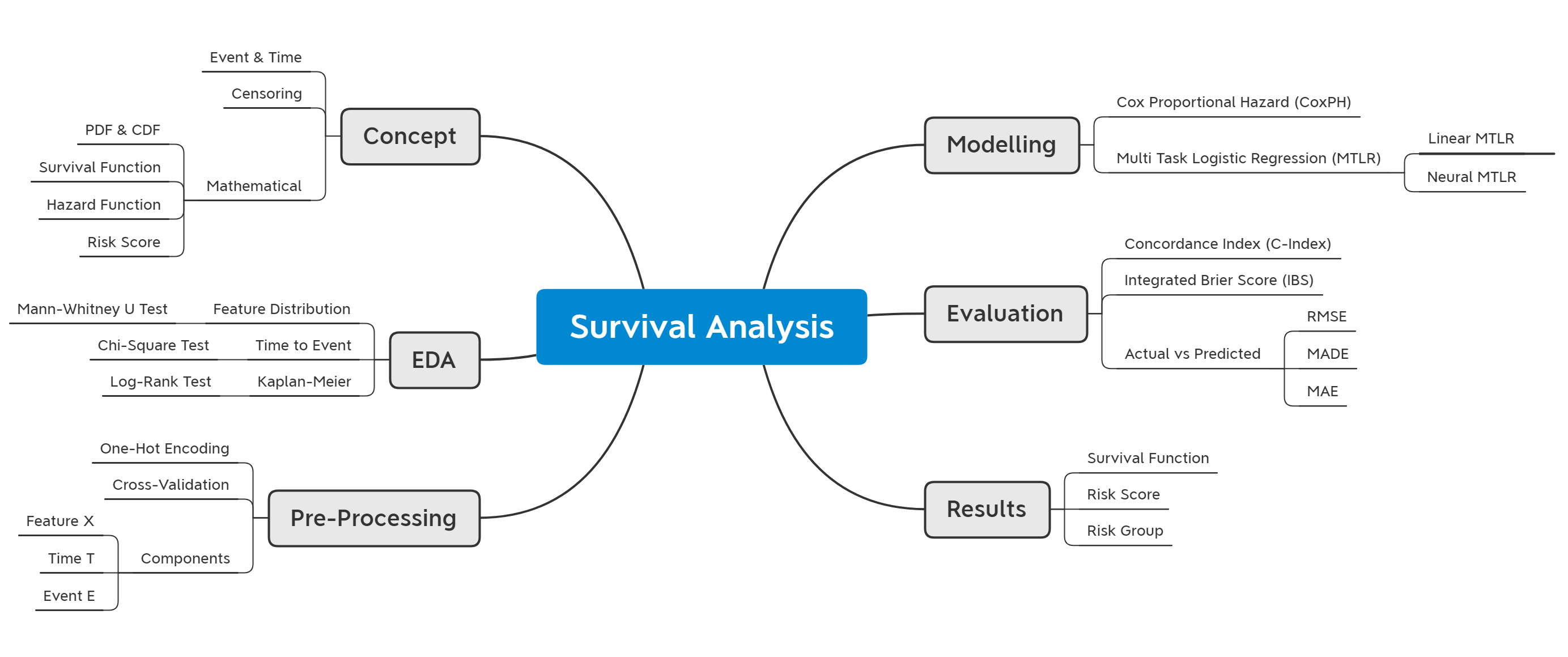
Survival Analysis for Predictive Maintenance
An implementation of survival analysis model for predicting the survival probability of a machine over time. We discuss both theoretical and mathematical concepts of survival analysis and its implementation using the pysurvival package. We explore several survival analysis approaches, such as Kaplan-Meier, Cox Proportional Hazard, Linear, and Neural Multi-Task Logistic Regression (MTLR) models. Models are compared using Concordance index, Integrated Brier Score, and prediction error. The best-fitted model is then used to predict the survival function over time and rank individuals based on their risk score.

- Introduction
- Concept
- Predictive Maintenance
- Model Comparison
- Results
- Optional: Mathematical proof for hazard function
- References
import pandas as pd
import numpy as np

# data visualization
import matplotlib.pyplot as plt
import seaborn as sns

# statistical test
from scipy import stats

# supress warning
import warnings
warnings.filterwarnings("ignore")
# reproducible model
import os
import random
import numpy as np
import torch

# reference: https://github.com/pytorch/pytorch/issues/7068#issuecomment-487907668
def seed_torch(seed):
    random.seed(seed)
    os.environ['PYTHONHASHSEED'] = str(seed)
    np.random.seed(seed)
    torch.manual_seed(seed)
    torch.cuda.manual_seed(seed)
    torch.cuda.manual_seed_all(seed) # if you are using multi-GPU
    torch.backends.cudnn.benchmark = False
    torch.backends.cudnn.deterministic = True

SEED = 123
seed_torch(SEED)
Introduction
Survival Analysis arises because of the many concerns about something that might happen and be detrimental to life. We will undoubtedly prepare meticulous planning through this survival analysis only if we know when the worst possibility occurs. In addition, we also want to know what factors are most correlated with these hazards. The first question that will always arise is how long an object will last?
Survival Analysis is a statistical method used to analyze longitudinal data regarding events or events, such as
- What is the probability that a patient will survive after doctor's statement of diagnosis?
- How long will a customer stay with the products we produce until the customer churns?
- How long can a production machine last after three years of use?
- How is the retention rate of different marketing channels?
- etc
The example above is very interesting to be discussed further. For a deeper understanding, this post will explain the basic concepts and workings of Survival Analysis and how it is applied in industry.
Event and Time
Survival Analysis is also known as time-to-event analysis. To better understand the concept of events and time, let's take a look the following application:
-
Marketing Analysis: The goals is to evaluate retention rates on each marketing channel. As we know, a company must have several services offered to customers according to the marketing targets that have been made. Here, we define the event as the act at which the customer unsubscribes from the marketing channel. Time is defined when the customer initiates a marketing channel service/subscription. The time scale can be months or weeks.
-
Predictive Maintenance: This analysis is used to determine the validity period for mechanical parts/machines. An event is defined as a situation where the machine breaks down. Time is defined as when the machine can operate continuously in the production process. The time scale can be weeks, months, or years.
Censoring
Survival Analysis sounds very similar to regression. So, why we use a different modeling technique instead? Why not just use a simple linear regression?
Survival analysis is explicitly designed to handle data about terminal events where some observations may experience those events and others may not. Such observations are called "censored". For example, the target variable represents the time to a terminal event, and the duration of study is constrained. Therefore, some observations will not experience the event. If we relate to the predictive maintenance case, some equipment will probably fail during performance monitoring, but some will not.
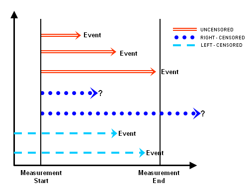
There are two types of censoring, namely right censored data and left censored data:
- Right censored data is the most common type of censoring that occurs when the observation ends or the individual is removed from the observation before the event occurs. For example, some individuals may be alive at the end of an observational trial or maybe dropped out before the study is terminated.
- Data will be called as left censored if the initial time at risk is unknown. This will happen if we do not know when the individual first experienced the observed event. For example, when the individual is infected with a disease.
Censoring concept slightly complicates the estimation of the survival function. Therefore, we need a different technique other than simple regression model. Thus, in addition to the target variable in the survival analysis, we need a categorical variable that indicates for each observation whether or not the event occurred at the time of censor.

Probability Density Function (PDF) dan Cumulative Distribution Function (CDF)
Let $T$ be a positive continuous random variable which represents time until the event happens.
- Probability density function (PDF) $f_T(t)$ represents the probability value of an event occurring at any time $t$ for the random variable $T$.
- Cumulative distribution function (CDF) $F_T(t)$ represents a function that adds up the probability value of an event occurring up to time $t$ for the random variable $T$.
Mathematically, $F_T(t) = P(T < t) = \int_0^t f_T(s)\ ds$
# generate dummy data
T = np.round(np.random.normal(loc=100, scale=10, size=10000))
t = np.linspace(T.min(), T.max(), dtype='int')
kde = stats.gaussian_kde(T)
df = pd.Series(kde.pdf(t), index=t, name='PDF').to_frame()
df['CDF'] = df['PDF'].cumsum()/df['PDF'].sum()
df = df.round(10)

# plotting
fig, ax = plt.subplots(1, 2, figsize=(10, 5), sharex=True)

ax[0].plot(df['PDF'])
ax[0].set_xlabel("Time $t$")
ax[0].set_ylabel("$f_T(t)$")
ax[0].set_title("Probability Density Function")

ax[1].plot(df['CDF'])
ax[1].set_xlabel("Time $t$")
ax[1].set_ylabel("$F_T(t)$")
ax[1].set_title("Cumulative Distribution Function")
plt.show()

Survival Function
Survival function $S(t)$ defines the probability that the event has not occurred or the object can survive up to time $t$. Mathematically it can be written as $S(t) = P(T \geq t)$, with the following properties:
- $0 \leq S(t) \leq 1$
- $S(t) = 1 - F_T(t)$ where $F_T(t)$ is CDF for the random variable $T$
- $F_T(t)$ is a monotonically increasing function, so inversely $S(t)$ is a monotonically decreasing function
fig, ax = plt.subplots(1, 2, figsize=(10, 5), sharex=True)

ax[0].plot(df['CDF'])
ax[0].set_xlabel("Time $t$")
ax[0].set_ylabel("$F_T(t)$")
ax[0].set_title("Cumulative Distribution Function")

df['Survival'] = 1-df['CDF']
ax[1].plot(df['Survival'])
ax[1].set_xlabel("Time $t$")
ax[1].set_ylabel("$S(t)$")
ax[1].set_title("Survival Function")
plt.show()

Hazard Function
The hazard function $h(t)$ defines the conditional probability that the event will occur at the interval $[t, t+dt)$ given that the event is not occurred. Mathematically it can be written as:
$h(t) = \displaystyle{\lim_{dt \to 0} \frac{P(t \leq T < t+dt\ |\ T \geq t)}{dt}}$
The above formula can be derived into (attached below this post):
$h(t) = \dfrac{f_T(t)}{S(t)} = - \dfrac{d}{dt} \ln S(t)$
So, survival function can be written in terms of hazard function as: $S(t) = e^{-\int_0^t h(s)\ ds}$
$H(t) = \int_0^t h(s)\ ds$ is further defined as cumulative hazard function.
fig, ax = plt.subplots(1, 2, figsize=(10, 5), sharex=True)

df['Hazard'] = df['PDF']/df['Survival']
ax[0].plot(df['Hazard'])
ax[0].set_xlabel("Time $t$")
ax[0].set_ylabel("$h(t)$")
ax[0].set_title("Hazard Function")

df['CumHazard'] = df['Hazard'].cumsum()
ax[1].plot(df['CumHazard'])
ax[1].set_xlabel("Time $t$")
ax[1].set_ylabel("$H(t)$")
ax[1].set_title("Cumulative Hazard Function")
plt.show()

J = 20
j = np.linspace(T.min(), T.max(), J, dtype='int')
j[-1] -= 1
df2 = df.reindex(index=range(int(T.min()), int(T.max())), method='ffill')

plt.plot(df['CumHazard'], label='Cumulative Hazard')
risk = 0
for j in j:
    y = df2.loc[j, 'CumHazard']
    plt.vlines(x=j, ymin=0, ymax=y, linestyles='--', color='red')
    plt.plot(j, y, marker='x', color='red')
    risk += y

plt.legend()
plt.xlabel("Time $t$")
plt.ylabel("$H(t)$")
plt.title(f"Risk Score: {risk:.2f} with {J} partitions")
plt.show()

Predictive Maintenance
Predictive maintenance is a maintenance strategy to predict the chances of when a machine will be damaged, it can be used to assist technicians in making repairs as a preventive measure for damage to a machine. According to a survey conducted by Deloitte, predictive maintenance analysis can reduce factory equipment maintenance costs by up to 40%.

Predictive maintenance is built based on an analysis of a machine equipment condition that is monitored in real-time. The monitoring process is assisted by sensors on the engine that can capture pressure, humidity, and temperature information on the engine, where some of these factors can be used to measure the performance of an engine.
Real-time data captured by several sensors is collected which is then stored in a cloud. The data can then be analyzed and visualized into a dashboard to be displayed to technicians. Up to this point, technicians only know the state of a machine. Then what about the predictive analysis process?
To perform predictive analysis, the existing data is further analyzed and a machine learning algorithm is applied, namely survival analysis which can produce a model. This model can be used as a decision parameter to determine the probability of damage to a machine over time. After the model is successfully created and produces the right results according to the business question, the maintenance specialist can determine the action plan to take preventive action on machine damage.
from pysurvival.datasets import Dataset
maintenance = Dataset('maintenance').load()
maintenance.head(10)
Here are the data description of maintenance:
-
Time component
-
lifetime: machine uptime, in weeks
-
-
Event component
-
broken: indicated whether a machine has broken or not
-
-
Features
-
pressureInd: pressure index, measurement of the flow of liquid through a pipe. A sudden drop in pressure may indicate a leakage. -
moistureInd: moisture index. Excessive humidity can cause mold and damage the equipment. -
temperatureInd: temperature index from thermocouple. Improper temperature can cause electrical circuit damage, fire, or even explosion. -
team: the team operating the machine -
provider: machine manufacturer
-
maintenance[['broken', 'team', 'provider']] = maintenance[['broken', 'team', 'provider']].astype('category')
maintenance.dtypes
maintenance.groupby(['team', 'provider']).count()['broken'].unstack().plot.bar()

plt.xticks(rotation=0)
plt.xlabel('')
plt.ylabel('')
plt.title('Number of Records by Team and Provider')
plt.legend(bbox_to_anchor=(1, 1), loc='upper left', title='Provider')
plt.show()

The frequency of recorded machine is not much difference for each team and provider, in other words the distribution is quite uniform. Next, let's plot the distribution of pressureInd, moistureInd, and temperatureInd for both provider and broken.
maintenance_melt = maintenance.melt(id_vars=['provider', 'broken'],
                                    value_vars=['pressureInd', 'moistureInd', 'temperatureInd'])

g = sns.FacetGrid(maintenance_melt,
                  row='variable', col='provider', hue='broken',
                  margin_titles=True)
g.map(sns.distplot, 'value', hist_kws=dict(alpha=0.2))
g.add_legend()
plt.show()

At a glance, it can be concluded that the bell curve plot shows that the three variables are normally distributed, and the distribution is more or less similar for broken and not broken. We can perform hypothesis testing to test whether the two distributions are statistically equal or not.
Mann-Whitney U: Tests whether the distribution of two independent samples is equal or not.
Assumptions:
- Observations in each sample are independent and identically distributed.
- Observations in each sample can be ranked.
Hypothesis:
- $H_0$: distribution of both samples is the same.
- $H_1$: distribution of the two samples is not the same.
from scipy.stats import mannwhitneyu

H0 = "same"
H1 = "different"
alpha = 0.05

ks_result = []
for var in ['pressureInd', 'moistureInd', 'temperatureInd']:
    for provider in maintenance['provider'].cat.categories:
        group = maintenance['provider'] == provider
        broken = maintenance[(maintenance['broken'] == 0) & (group)]
        not_broken = maintenance[(maintenance['broken'] == 1) & (group)]

        stat, p = mannwhitneyu(broken[var], not_broken[var])

        ks_result.append(
            {
                'provider': provider,
                'variable': var,
                'statistic': stat,
                'pvalue': p,
                f'result (alpha={alpha})': H1 if p < alpha else H0
            }
        )

pd.DataFrame(ks_result)
Using alpha = 5%, the majority of distributions are the same except for pressureInd from Provider4.
This indicates that it means that we cannot rely solely on numerical variables and providers in the modeling stage. We must also involve the lifetime time component when we want to predict the broken state of a machine.
sns.heatmap(maintenance.corr(), annot=True, cmap='Reds')
plt.title("Correlation Heatmap")
plt.show()

sns.histplot(x='lifetime', hue='broken',
             bins=25, alpha=0.2,
             data=maintenance)
plt.title("Number of Record by Machine Status")
plt.show()

It turns out that the failure begins when the machine has been active for at least 60 weeks. Then, what if we plot the above in detail for each team and provider?
def multihist(x, hue, n_bins=10, color=None, **kws):
    bins = np.linspace(x.min(), x.max(), n_bins)
    for label, x_i in x.groupby(hue):
        plt.hist(x_i, bins, label=label, **kws)


g = sns.FacetGrid(maintenance, col='provider', margin_titles=True)
g.map(multihist, 'lifetime', 'broken', alpha=0.5)
g.add_legend(title='broken')
plt.show()

We can clearly see the initial time when the machine failure occurred for each provider. We can sort the provider from the smallest lifetime: Provider3, Provider1, Provider4, followed by Provider2.
g = sns.FacetGrid(maintenance, col='team', margin_titles=True)
g.map(multihist, 'lifetime', 'broken', alpha=0.5)
g.add_legend(title='broken')
plt.show()

On the other hand, for each team, it can be seen that the initial machine failure time for team C is faster than for the other two. To be more confident with the two visualizations above, let's test the hypothesis as follows:
Chi-Squared: Tests whether two categorical variables are related or independent.
Assumptions:
- Observations used in the calculation of the contingency table are independent.
- 25 or more records in each value in the contingency table.
Hypothesis:
- $H_0$: two samples are independent of each other.
- $H_1$: two samples are mutually dependent.
from scipy.stats import chi2_contingency

H0 = "independent with broken"
H1 = "dependent with broken"
alpha = 0.05

chi2_result = []
for var in ['provider', 'team']:
    table = pd.pivot_table(data=maintenance,
                           index='broken',
                           columns=var,
                           values='lifetime',
                           aggfunc='count')
    stat, p, dof, expected = chi2_contingency(table)

    chi2_result.append(
        {
            'variable': var,
            'statistic': stat,
            'pvalue': p,
            f'result (alpha={alpha})': H1 if p < alpha else H0
        }
    )

pd.DataFrame(chi2_result)
Using alpha = 5%, we can conclude that the provider is dependent on the broken status of the machine, while the team is independent.
Kaplan-Meier
Kaplan-Meier is the simplest method for estimating survival function for each category in a population. Calculation of estimates in the Kaplan-Meier method involves the probability of an event occurring up to a certain time, then successively multiplied by the previous probability to produce the final estimate. Mathematically can be written as follows:
$S(t) = \displaystyle{\prod_{j=1}^k \frac{n_j - d_j}{d_j}}$
where $n_j$ represents the number of individuals at time $t$ and $d_j$ is the number of individuals experiencing the event at time $t$.
from lifelines import KaplanMeierFitter

kmf = KaplanMeierFitter()
for provider in maintenance['provider'].cat.categories:
    group = maintenance['provider'] == provider
    kmf.fit(maintenance['lifetime'][group],
            maintenance['broken'][group],
            label=provider)
    kmf.plot(ci_show=False)
plt.xlabel('Lifetime')
plt.ylabel('Survival Probability')
plt.title('Survival Function by Provider')
plt.show()

The plot above is in line with our previous findings where the fastest broken machine was from Provider3 and the slowest was Provider2. We can test the hypothesis to be more sure whether each provider has a different survival function.
Log-Rank: Tests whether two processes are of different intensity. That is, given two sequences of events, test whether the processes producing data differ statistically.
Hypothesis:
- $H_0$: two survival functions are the same.
- $H_1$: two different survival functions.
from lifelines.statistics import pairwise_logrank_test

def logrank_test(cat, alpha):
    H0 = "same"
    H1 = "different"

    lr_test = pairwise_logrank_test(event_durations=maintenance['lifetime'],
                                    groups=maintenance[cat],
                                    event_observed=maintenance['broken']).summary
    lr_test.drop('-log2(p)', axis=1, inplace=True)
    lr_test[f'result (alpha={alpha})'] = lr_test['p'].apply(
        lambda x: H1 if x < alpha else H0)
    lr_test.index.set_names(['First', 'Second'], inplace=True)

    return lr_test.reset_index()


logrank_test('provider', alpha=0.05)
It truns out that all survival functions were statistically significant. We can tell the maintenance team to pay more attention to the machines from Provider2, as they require early maintenance to prevent unexpected failures.
kmf = KaplanMeierFitter()
for team in maintenance['team'].cat.categories:
    group = maintenance['team'] == team
    kmf.fit(maintenance['lifetime'][group],
            maintenance['broken'][group],
            label=team)
    kmf.plot(ci_show=False)
plt.xlabel('Lifetime')
plt.ylabel('Survival Probability')
plt.title('Survival Function by Team')
plt.legend(loc='lower left')
plt.show()

The plot above is also in line with the previous finding where the survival function of the machine operated by team C is different from that of A and B. Let's do a log-rank test for the above visualization:
logrank_test('team', alpha=0.05)
It turns out that the survival function of the machine operated by TeamC is very different from that of TeamA and TeamB. The maintenance team can monitor whether the TeamC has operated the machine correctly or not, then can conduct training on machine operation to prevent premature machine failure.
Perform one-hot encoding for provider and team with pd.get_dummies().
categories = ['provider', 'team']
maintenance_dummy = pd.get_dummies(maintenance, columns=categories, drop_first=True)
maintenance_dummy.head()
Train-test splitting with 80:20 proportion
from sklearn.model_selection import train_test_split
index_train, index_test = train_test_split(range(maintenance_dummy.shape[0]), test_size=0.2, random_state=SEED)
data_train = maintenance_dummy.loc[index_train].reset_index(drop=True)
data_test = maintenance_dummy.loc[index_test].reset_index(drop=True)
Different from the typical supervised machine learning model, which only divides the data into X features and y targets. In survival analysis we divide the data into three components:
-
Xfeature contains numeric and categorical predictor columns - Time
Tcontains the column when eventEoccurred - Event
Econtains the class of events, in this case whether the machine is broken or not
features = np.setdiff1d(maintenance_dummy.columns, ['lifetime', 'broken']).tolist()
X_train, X_test = data_train[features], data_test[features]
T_train, T_test = data_train['lifetime'].values, data_test['lifetime'].values
E_train, E_test = np.array(data_train['broken'].values), np.array(data_test['broken'].values)
Cox Proportional Hazard (CoxPH)
The CoxPH model is widely used in statistics for multivariate survival functions because of its relatively easy implementation and high interpretability. CoxPH describes the relationship between the distribution of survival functions and covariates. The predictor variables are expressed by the hazard function as follows:
$$\lambda(t|x) = \lambda_0(t)\ e^{\beta_1x_1 + ... + \beta_nx_n}$$
The CoxPH method is a semi-parametric model because it consists of 2 components:
- The non-parametric component $\lambda_0(t)$ which is referred to as the baseline hazard, that is, the hazard when all covariates are zero.
- The parametric component $e^{\beta_1x_1 + ... + \beta_nx_n}$ is called a time-independent partial hazard.
- In general, the Cox model estimates the log-risk function $\lambda(t|x)$ as a linear combination of static covariates and baseline hazard.
The following is an implementation of the CoxPH model in survival analysis:
from pysurvival.models.semi_parametric import CoxPHModel
coxph = CoxPHModel()
coxph.fit(X_train, T_train, E_train, lr=0.5, l2_reg=1e-2, init_method='zeros')
Model Interpretation
The coef value in the summary model can be interpreted just like a linear regression model. A positive coefficient increases the baseline hazard value $\lambda_0(t)$ and indicates that the predictor increases the risk of the event occurring, in this case broken. Conversely, a negative coefficient will reduce the risk of an event occurring if the value is increased.
H0 = "not significant"
H1 = "significant"
alpha = 0.05

coxph_summary = coxph.get_summary()
coxph_summary[f'result (alpha={alpha})'] = coxph_summary['p_values'].astype('float64').apply(lambda x: H1 if x < alpha else H0)
coxph_summary[['variables', 'coef', 'p_values', f'result (alpha={alpha})']]
The assumption in the CoxPH model is proportionality assumption, the hazard function for two objects will always be proportional at the same time and the ratio does not change from the beginning to the end of time.
For example: if machine A has a broken risk of 2x compared to machine B, then for the next time the risk ratio remains 2x.
Properties of CoxPH model:
- Independence of observation: The time of occurrence of an event on one object will be independent of other objects.
- No hazard curves that intersect each other.
- There is a linear multiplication effect of the estimated covariate value on the hazard function.
Performance Metric
We can evaluate survival analysis model using two metrics, namely Concordance Idex (C-index) and Integrated Brier Score (IBS).
-
C-index indicates the model's ability to correctly rank survival time based on individual risk scores. C-index is a generalization of the AUC value. The closer the C-index is to the value of one, the better the model predicts, whereas when the value is 0.5, it represents a random prediction.
-
IBS measures the average difference between event labels and predicted survival probabilities. As a benchmark, a good model will have a Brier score below 0.25. IBS values always have a range between 0-1, with 0 being the best value.
from pysurvival.utils.metrics import concordance_index
from pysurvival.utils.display import integrated_brier_score, compare_to_actual


def evaluate(model, X, T, E, model_name=""):
    errors = compare_to_actual(model, X, T, E, is_at_risk=False)
    c_index = concordance_index(model, X, T, E)
    ibs = integrated_brier_score(model, X, T, E)
    metrics = {'C-index': c_index, 'IBS': ibs}
    eval_df = pd.DataFrame(data={**metrics, **errors}, index=[model_name])
    return eval_df.rename(columns={'root_mean_squared_error': 'RMSE',
                                   'median_absolute_error': 'MADE',
                                   'mean_absolute_error': 'MAE'})
eval_coxph = evaluate(coxph, X_test, T_test, E_test, model_name="Cox PH")
eval_coxph


Multi Task Logistic Regression Models
The Multi Task Logistic Regression (MTLR) model was first introduced by Chun-Nam Yu in 2011 to predict survival time in cancer patients (survival analysis). This model is an alternative to the Cox Proportional Hazard model which has several shortcomings, one of which is that the Cox model works using a hazard function rather than a survival function, so the model is less able to provide accurate predictions to analyze life expectancy.
MTLR has two approaches for its implementation of survival analysis modeling. The first model is Linear-Multi Task Logistic Regression and the second model is Neural-Multi Task Logistic Regression. The following is an implementation of the two models:
Linear-Multi Task Logistic Regression
Linear-Multi Task Logistic Regression is a set of logistic regression models built at different time intervals to estimate the probability of events occurring in that time span.
Several stages for the Linear MTLR process can be defined as follows:
- Divide the time variable into certain intervals
- Build a logistic regression model at each time interval
- Calculating the loss function to determine the optimum model
At this modeling stage, we create a MLTR model with the number of bins logistic regression as many as 100 models. We used adamax optimizer and 50 epochs to train the logistic regression.
from pysurvival.models.multi_task import LinearMultiTaskModel
l_mtlr = LinearMultiTaskModel(bins=100)
l_mtlr.fit(X_train, T_train, E_train, lr=1e-3, l2_reg=1e-6, l2_smooth=1e-6,
           init_method='orthogonal', optimizer='adamax', num_epochs=50)
eval_l_mtlr = evaluate(l_mtlr, X_test, T_test, E_test, model_name = "Linear MTLR")
eval_l_mtlr


The result above shows that the Linear MTLR model has a value of C-index = 0.938971 and a value of IBS = 0.044073. When the C-index is getting closer to 1 and the IBS is getting closer to 0, then the model can be said to have very good prediction results.
Neural-Multi Task Logistic Regression
Neural-Multi Task Logistic Regression (N-MTLR) is a model that was developed based on the previous MTLR model. The previous two models (CoxPH and regular MTLR) failed to capture non-linear patterns from the data and consequently can't satisfy certain cases. This model is supported by a deep learning architecture and can overcome the shortcomings of the previous model.
In the N-MTLR model, there are two improvements from the previous MTLR model:
-
N-MTLR uses a deep learning framework through multi-layer perceptron (MLP). By replacing the linear core, this model is more flexible because it will not rely on assumptions like the CoxPH model.
-
The model is implemented in Python using the open-source TensorFlow and Keras allowing users to combine many techniques in deep learning such as:
- Initialization: Xavier uniform, Xavier gaussian, etc
- Optimization: Adam, RMSprop, etc
- Activation function: SeLU, ReLU, Softplus, tanh, etc
- Miscellaneous Operation: Batch Normalization, Dropout, etc
from pysurvival.models.multi_task import NeuralMultiTaskModel

# simple structure
structure = [{'activation': 'ReLU', 'num_units': 100}, ]

# fitting the model
n_mtlr = NeuralMultiTaskModel(structure=structure, bins=100)
n_mtlr.fit(X_train, T_train, E_train, lr=1e-3, num_epochs=500,
           l2_reg=1e-6, l2_smooth=1e-6,
           init_method='orthogonal', optimizer='rprop')
eval_mtlr_1 = evaluate(n_mtlr, X_test, T_test, E_test, model_name = "Neural MTLR 1-hidden layer")
eval_mtlr_1


We can also inspect the loss values for each epoch using display_loss_values function:
from pysurvival.utils.display import display_loss_values
display_loss_values(n_mtlr, figure_size=(7, 4))

eval_all = pd.concat([eval_coxph, eval_l_mtlr, eval_mtlr_1])
eval_all
Referring to the C-index value, we can see that the CoxPH model is the best performance compared to other models, which is 0.96. However, from the error, it turns out that this model actually has the highest RMSE value compared to other models. So we can say that the CoxPH model is not very good at predicting because this high bias could indicate an overfitting in the model.
Just like the CoxPH model, the L-MTLR model also has a fairly good C-index performance but the error generated is still larger than the N-MTLR model. So in this case, we use the N-MTLR model as the best model because in terms of the C-Index value which is quite good and have the smallest error compared to other models.
best_model = n_mtlr
Risk Score
At the model comparison, we conclude that N-MTLR is the best model. In this section, we'll use this model for individual prediction and grouping of individuals based on their risk score.
The first step, we will calculate the risk score of each machine. The value of this risk score will later be used for grouping, both for the score distribution or other grouping methods.
risk_profile = X_test.copy()
risk_profile['risk_score'] = best_model.predict_risk(risk_profile, use_log=True)
risk_profile.head()
We group the risk_score using 1 dimensional K-Means. From the grouping results, we obtained 3 clusters, namely low, medium, and high. Since the C-index is quite high and the model error is low, the model can be said to be quite good in determining the survival time ranking of random individuals in each group, so it is found that $t_{high}<t_{medium}<t_{low}$
from sklearn.cluster import KMeans

kmeans = KMeans(n_clusters=3, random_state=SEED).fit(risk_profile[['risk_score']])
risk_profile['risk_group'] = kmeans.labels_

risk_group_bound = risk_profile.groupby('risk_group')['risk_score'].min().sort_values().to_frame()
risk_group_bound.index = ['low', 'medium', 'high']
risk_group_bound.columns = ['lower_bound']
risk_group_bound['upper_bound'] = risk_group_bound['lower_bound'].shift(periods=-1).fillna(risk_profile['risk_score'].max())
risk_group_bound['color'] = ['red', 'green', 'blue']
risk_group_bound
We can illustrate the risk group using the following histogram:
from pysurvival.utils.display import create_risk_groups

risk_groups = create_risk_groups(
    model=best_model, X=X_test, num_bins=50,
    **risk_group_bound.T.to_dict())

fig, axes = plt.subplots(3, 1, figsize=(15, 10))

for i, (ax, (label, (color, idxs))) in enumerate(zip(axes.flat, risk_groups.items())):
    X = X_test.values[idxs, :]
    T = T_test[idxs]
    E = E_test[idxs]

    broken = np.argwhere((E == 1)).flatten()
    for j in broken:
        survival = best_model.predict_survival(X[j, :]).flatten()
        ax.plot(best_model.times, survival, color=color)

    ax.set_title(f"{label.title()} Risk")

plt.show()

Instead of looking for all survival function, let's take one random observation from each group that has experienced failure (event = 1).
plt.figure(figsize=(15, 5))

for i, (label, (color, idxs)) in enumerate(risk_groups.items()):
    record_idx = X_test.iloc[idxs, :].index
    X = X_test.values[idxs, :]
    T = T_test[idxs]
    E = E_test[idxs]

    # choose a machine at random that has experienced failure
    choices = np.argwhere((E == 1)).flatten()
    k = np.random.choice(choices, 1)[0]

    # predict survival function
    survival = best_model.predict_survival(X[k, :]).flatten()
    plt.plot(best_model.times, survival,
             color=color, label=f'Record {record_idx[k]} ({label} risk)')

    # actual failure time
    actual_t = T[k]
    plt.axvline(x=actual_t, color=color, ls='--')
    plt.annotate(f'T={actual_t:.1f}',
                 xy=(actual_t, 0.5*(1+0.2*i)),
                 xytext=(actual_t, 0.5*(1+0.2*i)),
                 fontsize=12)

plt.title("Survival Functions Comparison between High, Medium, Low Risk Machine")
plt.legend()
plt.show()

The plot above shows the survival function for the three risk groups by taking 1 random machine record. As can be seen, the model successfully predicts the broken event. There is a sudden decrease in the survival value, according to the vertical dotted line, which is the real broken time.
Optional: Mathematical proof for hazard function
It is defined that $h(t) = \displaystyle{\lim_{dt \to 0} \frac{P(t \leq T < t+dt\ |\ T \geq t)}{dt}}$
According to the conditional probability rule $P(A|B) = \dfrac{P(A \cap B)}{P(B)}$ then:
$h(t) = \displaystyle{\lim_{dt \to 0} \frac{P(\{t \leq T < t+dt\} \cap \{T \geq t\})}{P(T \geq t)\ dt}}$
- Since $T \geq t$ is a subset of the interval of $t \leq T < t+dt$ then $P(\{t \leq T < t+dt\} \cap \{T \geq t\}) = P(t \leq T < t+dt)$
- Definition of CDF: $P(t \leq T < t+dt) = F_T(t+dt) - F_T(t)$
- Definition of survival function: $P(T \geq t) = S(t)$
From the three definitions above: $h(t) = \dfrac{1}{S(t)}\ \displaystyle{\lim_{dt \to 0} \frac{F_T(t+dt) - F_T(t )}{dt}}$
According to the definition of the derived function: $h(t) = \dfrac{1}{S(t)}\ \dfrac{d}{dt}F_T(t)$
Using the relationship between PDF and CDF we get the first equation: $h(t) = \dfrac{f_T(t)}{S(t)}$
Using the CDF relationship and the survival function: $h(t) = \dfrac{1}{S(t)}\ \dfrac{d}{dt}[1 - S(t)] = -\dfrac{S'( t)}{S(t)}$
According to the derivative of the logarithmic function $\dfrac{d}{dx} \ln f(x) = \dfrac{f'(x)}{f(x)}$, then we get the second equation: $h( t) = - \dfrac{d}{dt} \ln S(t)$
References
- PySurvival package
- Lifelines: Introduction to Survival Analysis
- Deep Learning for Survival Analysis. Laura Löschmann, Daria Smorodina. (2020)
- Deep Neural Networks for Survival Analysis Based on a Multi-Task Framework. Fotso, S. (2018). arXiv:1801.05512.
- Multi-Task Logistic Regression (MTLR) model created by Yu, Chun-Nam, et al. in 2011